
Photography is one part technical and one part artistic. Many people may argue that once you have an image in the camera, that is where photography ends. Others prefer to use photo editing techniques to enhance the camera image and make it match their vision more closely – their artistic rendering.


So which is right – to edit or not to edit?
That question is up for debate, but the topic for this month’s challenge is to get editing some images.
Try some things and experiment. If you’ve never edited photos before, now is a good time to try it and see if you like it.
You can always go back to not processing later. Or if you are a regular image processor, it’s also a good time to check out some new ideas, techniques, and methods you would never use on your own images.
Yes, that’s right I’m going to give you FIVE of my own images (JPG and DNG files) to play with!

Winner of last month’s challenge – simplify
There was a boat load of entries and comments on last month’s challenge to simplify. I read all the comments and looked at all the images. Here are a few things I heard you learning:
- I love intimate landscapes and usually use telephoto. I was surprised to discover I could make a minimalist image at 24mm. – Barbara F Smith
- Darlene, Your challenge was perfectly timed. Our local club, The Southern Colorado Photography Society, held their annual outing downtown Pueblo (snip). Having photographed the area many times, your challenge gave me a new perspective, so to speak, and shaped my entire shooting experience for the day. One of the things about your challenge is it got me focusing on elements of design. So on the photo walk, I was looking for tonal ranges, shapes, leading lines, etc. – David Hayden
- This challenge was a great one as it gave me an opportunity to look closer and more critically at what I choose to photograph. By this I mean to focus more on what I see, and in so doing, look at different ways to capture it. I’m sometimes too “trigger happy” and just want to take the shot without really looking at how else the scene can be captured. A great lesson learned. – Folake Abass
- I learned from this lesson, it’s not all about the gear, it’s what you see before you and how you capture it. – P James
- I went to shoot Waterton lakes at sunset with my brother, but we didn’t have the amazing colors we were hoping for, and I was disappointed until I remembered this challenge and decided to focus on “simplify”. The view was amazing and almost overwhelming of mountains and lakes, so I got some decent shots of the whole view, but the ones I really like, are the ones where I focused on one element. – Rebecca Cullimore
Rebecca’s image - “I always tend to put too much in a picture in order to share the emotion of the subject. Thank you for reminding me that often, less tells more! – Solange Paquette
- When I was reviewing the images, I realized that even a simple picture can tell a larger story. Looking at the bike hub, you can see the dirt and grease that tells you this bike is not a showpiece. It’s *used*. The bolt has a little rust on it, which can tell you that it was left outside a few times, or at least it got a little wet. But you can also see that the spokes, frame, and paint are in good condition, so it does get *some* care. That also reminded me that you can sometimes tell a better story if you leave details out. – Wayne Werner
And the winner of the Simplify challenge is . . .
Each month we randomly select one winner from all the eligible entries and this month it was:
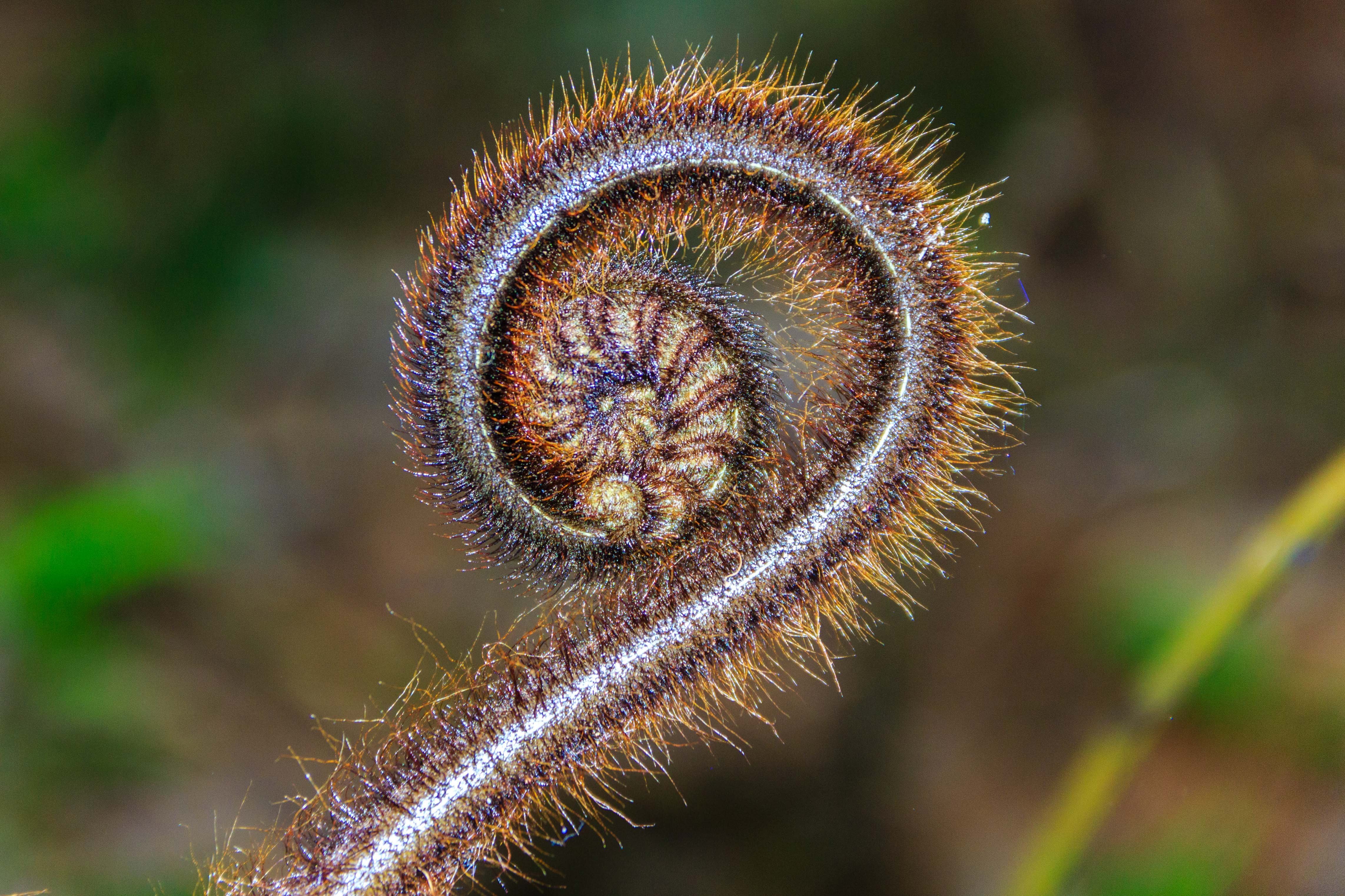
Lynne – who took this fabulous “simple” image of a New Zealand Koru fern. She will be getting five of her images reviewed privately by me. Congratulations!
Details of this month’s challenge – Get Editing
First of all you need to download the images to participate in this challenge. You can download either the full raw files (as DNGs) or full JPGs (unedited straight from the raw files). If you are using free software or an online one, use the JPGs. If you are familiar with processing raw files grab the DNGs.
Download them by clicking on the one you want, then clicking the down arrow at the top of the screen to save it to your computer. Please DO NOT upload your finished files to these folders this is for downloading only!
- Grab the JPG files here.
- Grab the DNG files here.

They are large files – so they may take a while to download. If you have trouble let me know.
There are many ways and many tools with which to process images. My tools of choice are mostly Lightroom and Photoshop, with a few plugins on the side. If you have Lightroom or Photoshop you can check out some of these for tips:
Lightroom articles:
- Using the Basic Sliders in Lightroom and Photoshop; a Comprehensive Tutorial
- Correct Your Images in Under 2 Minutes Using Lightroom 5
- Clarity Versus Contrast and How to Use Them to Make Your Photos Pop
- Learn to MASTER Lightroom in my new Lightroom for Photographers course
Photoshop articles:
- How to Create a Neat Text Effect in Photoshop
- Making Art With Your Photography
- How to Give Your Pictures an Authentic Vintage Appearance
- Learn how to use Photoshop in my Photoshop for Photographers course
If you don’t have or use either of those you could try out some of the free options available such as:
- GIMP
- Darktable
- Picmonkey
- Paint.net
- Snapseed (it’s not free but it’s only a few bucks and works on your tablet or mobile devices only – get the Android version here – or for iOS devices here.
Examples
So if you want to see what I did with the images provided here are a few versions I’ve used different places:


To be eligible to win the prize:
In order to participate in this challenge and be eligible for this prize you need to:
- Upload your processed version of one of the images provided to the comments section below
- Tell us how you processing it (what software or online tools, what things did you try and apply).
- Tell us about your experience and what you learned by doing this challenge? Is this your first time processing images? How did it feel? Did you enjoy it? Was it fun? Did you feel creative? If you’re not new to processing – did you try a new technique? Tell us about that.
- Upload your photo, processing info and what you learned by the cut-off date of August 31st, 2016 (11:59 pm EST or UTC-5). NOTE: please do NOT save your images as TIF (they will be too big to add in the comments, must be under 2mg) and please do NOT email your images to me for critique. I cannot give personal critiques by email, leave your images below and I will comment there..
- Indicate whether you use a Mac or a PC (this will dictate eligibility for prizes, see bel0w)
You may post more than one finished photo, and do this as many times as you like over the month (you can comment as many times as you like, and share as many processed versions of the photos provided as you want – but it will be counted as one entry per person). The more you practice the better you’ll get at it, like anything – so share away. I also encourage you to share the link to this challenge with a friend so you can do it together!


The Prize
This month’s winner (selected randomly) will receive a set of our Lightroom Presets (value $19).
And Skylum has graciously added a copy of their Creative Kit software, a $179 software package for Macintosh computers, for a second winner ( mac only).
Now get processing and let’s see what you come up with!
Cheers,

that’s a fun look
UPDATE: I’m closing the comment thread on this challenge as I’ll be picking the two winners randomly and will let you know if you have been chosen. Watch for a new challenge coming soon!!
Hi there,
When processing this image I wanted to maintain the rugged feel, but I wanted to highlight the man a bit more.
I decided to try to emphasize him by adding a light beam coming from the top right (maybe a hole in the side of the shed) – to match his face highlighting and finishing bottom left, where it could reflect back to the barrel.
I used a series of curve layers in photoshop to get progressively darker as the beam spread, finally leaving the background quite dark, but not hiding the background clutter totally.
I added another curves layer with a cloud filter to give a slightly dusty feel to the beam.
I then applied a curve layer to add some contrast to the mans face shirt and arms.
It was a frustrating process at times to get the blending right for the beams to make the light drop off without looking unnatural, adjusting brightness and blur on each of the 3 layers.
I was extremely pleased with the final outcome that it achieved the effect I was looking for.
I am a PC user.
Oh very nice, I love the shaft of light. So appropriate for a mine, which also has mine shafts!
Hello again Darlene,
Here’s another go at the bridge photo. This time I have made it into a night time scene with moonlight reflected in the water. I’ve also added highlights to the rocks and grasses in the foreground. If you look really closely, I’ve also added red lights to the tops of the bridge supports and removed the piece of grass that was in front of the bridge. :-). All the above was done with Corel Paintshop Pro X6.
Cool!
Hi Darlene, First time response to a Challenge.
I started with opening in Lightroom for basic adjustments. Corrected Upright Perspective, cropped lower part of photo to change leading lines and eliminate some of the foreground clutter. Adjustments to Exposure, Temperature, Shadows, Blacks, Clarity, Vibrance and Saturation. Added Graduated filter from sky through to bridge pylons adding clarity and reducing colour temp to bring blues into clouds. Then moved edit into ON1 Photo 10 Effects for Layered Filters. 1. Tone Enhancer to pop the richness of the colours, 2. Dynamic Contrast to define all edges, 3. Sunshine to add warm glow to clouds, water and weeds, 4. Adjustment Brush to lighten shadows on rocks in LH corner, 5. another Adjustment Brush to add detail to trees across the river on LH side bank, 6. Glow added to sky to add richness and detail to clouds and finally 7. a soft Vignette.
Over the last six months I’ve being playing with more directed processing using ON1 Photo 10 to try and take my photos to another level, more artwork than photo. I found it interesting to take your photo and interpret it my way, not having seen the location, but once cloud detail revealed made the decision to create a moody atmosphere showing approaching menacing clouds battling with the sunlight. Hopefully I’ve achieved this. I am a MacBook Pro user.
I think it’s well balanced with complementary colors and tones. I think you did a great job with this.
When I saw the challenge for this month my first thought was – I cannot participate in this challenge. My knowledge of post processing is very limited. I did download paint.net and realized very quickly that I would not be able to learn this program in a month’s time. I was encouraged and inspired by the photos posted by photographers on this site so I decided to give this challenge a try. I use a PC and have used only the photo processing options it provides. For the photo of the bridge, the option of an eraser was not available so I cropped the photo to leave out some objects I thought were distracting, I used selective focus to highlight the bridge and then adjusted brightness,contrast,highlights,shadows,temperature and saturation. Unfortunately I forgot to write down the degrees and try as I might I could not duplicate the initial settings. In the photo of the miner, I cropped the photo again and used selective focus to highlight his face and the mural on the wall,which I think adds to the story of the photo; also adjusted the temperature,tint, and saturation. The possibilities seem endless and the original photo can become almost completely lost during processing, but I must admit I enjoyed it and I think if a suitable photo becomes available I will try it again. Thank-you Darlene for making your photos available for us to experiment with.
great job jumping in and doing it in spite of your initial thoughts
Thank you for the encouragement
I had fun with this one. Inspired by the interpretations of this photo, I thought I might experiment with something completely different. In Lr, I opted for Custom colour – Temp went down to 4,300 to increase the blue tone and Tint slightly up to +8. Then I did standard adjustments to Highlights -100 and Shadows +100 with a few tweaks to blacks and Whites. In Ps, I played with the Crop tool, but actually preferred the image as it is. I then added an HDR Filter from Nik and this really made the daisies pop in a 3D kind of way. I liked the bright colour scheme so I added a soft Glamour Glow Filter, again from Nik. I quite like the overall effect. It certainly has brightened up an abandoned wall, which is what the Graffiti artist intended, no doubt.
My learning here again has been high. I am beginning to make adjustments automatically in Lr and actually looking at the colours on the screen as opposed to relying on the clipping masks. I have also had an opportunity to experiment with more of the filters in the Nik range to see what they can offer. I also made a decision not to crop the photo, because I liked it just as it is for the effect I was after. And most importantly, this has motivated me to want to have a go! I am a mac user.
Thanks again!
Great I’m glad to have been the motivator!
Another technique I wanted to try was to change the colours in the photo – to experiment with morning and evening looks. Purple skies are quite rare so I thought I would have a go at that. In Lr I took temp down to 6000 and the Tint up to +65. I reduced Highlights to -50 and brought Shadows up to +65. I reduced Blacks to -61. i adjusted Clarity up and vibrance and Saturation down a little. the main area I wade adjustments was in the HSL section. Blues Hue +77, Saturation +34, Purple Hue -65, Saturation +57. Then I played with Luminance on both, bringing them down until i liked the overall look. In Ps, I cropped to a 1:1 and added a different filter from Analogue Efex Pro2. never even opened this set of filters before. back in Ps, I applied the LighterColour blending mode to this filter and then flattened all.
I quite like the effect. Again, I learned a lot by just playing with the sliders and seeing how the Temp and Tint ranges change the overall feel of the image. I also got to play with the Blending modes. I hadn’t thought to do that with the commercial filters. Cropping was harder. I decided on a square to emphasise the diagonals in the photo. really enjoyed this. Once again, lots of learning and always fun! I am a mac user.
that’s a different crop, way to be creative
I use Lightroom for processing. This image shows great details, and I wanted to highlight that as well as give a sense for time of day. I used split-toning to force warmed tones over a slightly cooled white balance, and graduated filters reduce the highlights in sunn-soaked edges. Heightened contrast, clarity, and sharpness bring out the details very well, and the crop ratio with diagonal lines creates a good composition.
The geometric edges, ornate details, and scale compete somewhat, so the cropping and angling was meant to reduce the available scope and place diagonals escaping off corners of the image.
I use a Windows 10 PC.
I found it interesting how everyone saw my images differently. This one was about distortion and leading lines upwards. Having them cropped out, I feel, makes the image less effective and dramatic. Do you see that?
I use Lightroom for processing. This virtual copy was a good candidate for developing a lighthouse-focused image. I amped the lost focus by dropping the clarity, sharpness, and contrast. The split toning offers a strong violet coloration which seems a bit weak, but reduces (for me) the desire to see a sunset moment; this violet finishing gives a sense of being dreamy or fantasy.
Rather than attempt to recover the lack of focus, I leaned toward that to develop a sense of dreaming or viewing a fantasy both by lowered clarity and sharpness as well as a split tone B&W image.
I use a Windows 10 PC.
I use Lightroom for processing. In this image, I didn’t feel a compelling need for the people in the scene, but I could only do so much to the sharpness of the lighthouse. As a result, I pushed white balance slightly cool and used color sliders with split toning to create the rosy, warmth of early moments of sunset. The soft lighting with low contrast made that feel very easy.
I like the car and lighthouse, but would prefer the lighthouse as the point of focus with the car existing in a bokeh foreground. I’m not into cars, but it helps that this has such a nostalgic appearrance with a classic model.
I use a Windows 10 PC.
LOL you do realize this is Cuba right? It’s all about the cars there. The fort is background.
I use Lightroom for processing. In this image I chose a softening preset, then used a graduated filter to return clarity and sharpness to the face. The white balance has been strongly warmed before a warm B&W preset was used to develop a somewhat burnished appearance of a metal plate.
I appreciate the subject having a clear and unobstructed position in the frame and the indications of work life in the background. The age and aging seem to hint at a changing workforce in industry.
I use a Windows 10 PC.
This one shows really dark here, did you mean it to be this dark? Does it look different on your screen?
The watermark with your copyright and name are on all the images you posted. I’ve given access to my images to play with but it does not give the copyright to you. I’d prefer if you removed the watermarks. The issue is that if this image gets picked up by someone else they now think it is yours not mine, which is incorrect.
I did lower the overall exposure and used graduated filters to further darken the surroundings. So, that’s displaying quite dark with highlights on the subject.
I apologize about the watermarks on all the images. I had quickly used a preset for export and had not thought about the watermark. I can’t swap the images using Disqus; I think it would only allow to delete and create a new comment w/ posted image.
No worries I figured as much. Just make sure to not post them anywhere else like this. Don’t worry about deleting them.
As for the dark image – dark is one thing but this one doesn’t have any highlights left. If printed it would be mid-grey to black. Do you have a calibrated monitor? Use the histogram to check for pure white and black?
See the histogram here on it? It’s pushed all the way to the right and there are very few tones other than black and dark shadows. Not even middle gray. https://uploads.disquscdn.com/images/eb659587a09dc3754bddc561e0b2428b57c199c793ed9716a50fff64f4801194.png
see the difference now? Still moody but there is highlights now. Obviously would be better going from the original raw file. https://uploads.disquscdn.com/images/02878b5463eb183dce6d467d72ec15de9ef847603d59f9decd7eb15a0c929e54.png
I use Lightroom for processing. In this image, I’ve pushed the white balance into a far cool before using a blue filter preset. The reduced exposure and graduated filters are intended to draw viewers to the blooming flowers.
I’m uncertain if this has statement of juxtaposition between the flowers and graffiti on a brick wall. I suppose that feels quite natural to me, so I didn’t sense a compelling composition in highlighting the artwork. I rather emphasized the flowers for their natural beauty than giving focus to the human-made artwork.
yes it was about the juxtaposition between the two things that caught my eye.
I use Lightroom for processing. In this image, I’ve pushed down highlights, shadows, and whites from a slight exposure increase; the white balance has been cooled, and the greens are tinted in. The colors have several variations, so overall the colors are pushing toward preserved pinks, reds, oranges, and yellows in the cool white balance. Split toning adds green-yellow into highlights and muted yellow-orange into shadows. Graduated filters over the sky and over the vegetation increase sharpness and clarity in those portions.
I don’t quite like the composition of the bridge, as there are no leading lines to return viewers from across, and the indication of a near-side exit is lost. I’ve done something of each image to practice multiple ideas. In this challenge, I chose to tinker with presets, but ended up making several adjustments away from the preset in my own tastes.
Nice version but just an FYI, please do not put your copyright mark on someone else’s image. You cannot copyright the process only the image. I’m guessing it’s an automated export that ads it?
Hi Darlene,
At Evening Classes for Ps CC I learned a neat processing technique for adding drama and high contrast to portraits (usually only works for men). I have been wanting to try it myself but I haven’t taken any pictures that have offered the opportunity so photo #3 of the miner is ideal or this.
First, I did basic edits in Lr – Highlights all the way up and Shadows right down. I adjusted Whites by eye to +16, left Blacks alone and turned up Clarity to +21. This created a good starting point for the texture I was seeking.
Then I opened the image in Ps CC. I cropped the image tightly to 1:1 ratio with left eye placed on the cross hair of top and right third.
Next, I googled how to add light to the lamp on his head. I chose an Adobe tutorial which took me to Filter > Render > Lens Flare. I played about with the adjustments until I was satisfied with the effect. I ended up with Brightness at 57% and chose the 105mm Prime lens.
Next, I duplicated the layer and created a high pass filter – 19% with 5% pixels (no idea why – it looked dramatic!). Finally, I adjusted Levels to remove clipping and used the Spot Healing Brush to delete the pipe on his right side as cropping had made it obvious. (Maybe I should have done this part after the crop and before adding the High pass Filter). I left the remainder of the background untouched as it added to his story.
My learning here was high. The exercise made me revisit something I had been shown but had never used. I still have to understand what impact the percentage has on the High Pass Filter. I also had a play with adding a light flare to the lamp, again something I have never done before. I forced myself to crop harder than I usually do and to think about where I was placing the face on the grid and why. I’m pleased with my efforts. I am really enjoying this challenge. I have come home from work and am motivated to go over notes I wrote from class a couple of months back but have never looked at again. Now I am starting to make lists of all the things I want to go over so next time I am going to use another of these images to practise a different technique I want to revisit.
Thanks for giving me the opportunity with your images to let me do this. (I am a mac user.)
Cool. Yes never do this on a woman! LOL. It goes a bit too far for my tastes but I think Bob may actually like it. He’s very funny and actually enjoys posing for me at my workshops. I’ll see in again in 10 days at my next one.
Hi Darlene
For my second attempt, I chose image #5. I wanted to create a dramatic b&w look with lots of contrast and also to make it look old. I have a list of tutorials to watch on YouTube for Lr that I have been meaning to sit down and go through so I chose follow Anthony Morganti’s video for Learn Lr 6 – #3 for B&W to assist with the initial edits.
To get some contrast, in the Basic palette, I pushed Highlights down to -85 and Shadows right up. Whites were tweaked at -9 and Blacks -31. I pulled Clarity up to +65 and Contrast to +37. I could see more shades of yellow in the colour tones which I hoped would provide variations in the grey once converted. In Detail, I sharpened but did not add any noise reduction because of the final effect I was after. Next, I converted to B&W. With a hard brush, I created a Custom Mask three times adjusting Contrast, Clarity Shadows and Highlights. I just kept creating new brushes, sweeping each brush into corners and down the front of the columns to create lighter and darker places where I wanted them using the sliders. I quite liked the image at this stage but I wanted more harsh contrast so I opened the image in Ps and selected a couple of Silver Efex Pro2 filters. I have found that when I use Nik software in Lr, my original edit history is overwritten so this is why I go to Ps. The first I selected was High Structure Harsh to really bring out the lines in the architecture and the second was Vintage Film Noir 030. I also removed a couple of sensor spots which appeared once the filters were applied by using the Clone Stamp Tool.
So my learning here was to practise b&w using Lr tools; to follow one of the tutorials I have on my list to watch and to use a blend of filters in Nik that I haven’t used yet to create the dramatic, vintage look I was after. I haven’t ever really considered what impact the masks/brushes might have on my image until today and how adjusting the sliders altered areas selectively as opposed to the whole image. I had a lot of fun with this. It was great to work on a structure that had lots of detail and contrast too. I certainly thought about what I was doing and felt creative in the process. Thank you.
you did this with the Nik b/w plugin? I love the grittiness.
Yes I did! Thank you – it was an honour to see it featured.
Hello Darlene.
I very much enjoyed this exercise – thank you for doing this. I tried my hand at all of the images and I was most pleased with my results on two of them. This one is my first choice – the Bridge Too Far. The subject of this image is clearly the bridge, and the foreground detail provides a nice frame.
I started in Lightroom (LR CC 2015.6.1). First I applied a personal preset that I have found works well for the combination of my old Nikon D300 (that I still love), my old 24” iMac (due for replacement very soon) and my old eyes (that I seem to be stuck with). The preset includes the following;
Exposure no change
Contrast +10
Highlights -20
Shadows +15
Whites -25
Blacks -30
Clarity +35
Vibrance +10
Saturation +10
A slight positive “S” curve
Remove Chromatic Aberration
Enable Profile Corrections
Next, I ported over to PhotoShop (PS CC 2015.5) for further work.
Using content-aware fill, I removed several distracting elements, such as the two red “things” on the far shore, as well as the grass stalks and fronds that were above the near shoreline and intruding on the view of the bridge. I also removed quite a few of the grass stalks that were aligned more in the horizontal plane. This was done in order to declutter and also to enhance the ability of the vertical grass stalks to “point” to the bridge.
Still in PS, I applied straightening to the two left-most bridge towers to remove convergence. This left crop gaps at the top left and right, so I used content-aware fill to clean those up.
Next, I wanted to sharpen up the bridge so I applied the “High Pass Filter” technique to the whole image, then brushed away the sharpening on all but the bridge itself.
Then back to LR where I used the adjustment brush to add a little colour depth to the sky and the water. I found it was very easy to over-do this step so I stayed with a minimum adjustment.
And finally, I cropped in a bit from the lower left to further highlight the bridge and added a touch (+5) of Dehaze. That’s it.
I shoot with an eight-year-old Nikon D300, and I do post on an eight-year-old 24” iMac.
I used Lightroom (LR CC 2015.6.1), PhotoShop (PS CC 2015.5) and the Topaz suite, mostly DeNoise 6.
I learned to try hard to not over-process as this easily leads to an image that looks over-cooked. I applied some techniques that I have only recently learned and I was pleased with the results.
I believe that image processing is fundamental to the “art” of photography. The objectives are either to make the image look like what I saw with my eye when I made the exposure (the main case) or to use an image as a starting point to create something artistic (the case I’m trying to learn).
nice rendering
Hi Darlene- I have been following you and your competitions for a while now but never felt ready to enter my work. This months theme seems the perfect way to get started. I haven’t been shooting very long but am willing to have a go at anything. I want to learn about processing techniques and how I can take my images from ‘ok’ to ‘wow’!
I am a Mac user and I always import images directly into Lr. I don’t always use Develop here but I always start by observing the Histogram and playing with Basic adjustment sliders. I’m learning to read the Histogram and the peaks in the original photo seemed to indicate to me that it was over exposed. It could also have been an intentional high key photo but I decided to try to balance this one. So, I moved Highlights to -100; white clipping -23, black clipping +28, then shadows +100, Clarity +21 and Contrast +22. I then opened in Ps and cropped, maintaining 3:2 ratio. For my first attempt, I wanted to crop the image so the eye was drawn to the couple. I removed the group to the right, reduced some sky top left and pavement bottom left. This helped to place the couple centre/bottom middle third of picture. Once cropped, I adjusted the Levels in Ps, going through all the colours individually to reduce the brightness by moving the middle and right sliders to the left slightly and bring back some colour that had been clipped. I then defaulted to the Color Efex Pro 4 Nik software. I added the 06 Warm Filter in the Brilliance/Warmth range. I love these filters as I find they bring out colour tone and detail in architecture. I wanted the lighthouse and the fort to provide the background interest as I had cropped out a lot of the sky, which was where most of the overexposure was. I flattened the image and then added the the Maximum Depth filter (02) from the Darken/lighten Centre group of filters. This was to create a vignette and to draw the eye in towards the couple. I then used the Dfine2 program to reduce noise and sharpened in Ps using the Unsharp mask at R1.4 and 130%.
I really enjoyed this. I realise it’s the first time I have sat down and thought about how I want my image to look once finished. Maybe it’s because I didn’t have any history or memory to influence me. It has taught me consider the story I want to tell and how I might want to tell it. In this picture, I decided to focus on two people having a conversation. They appear to have no thought or care for anyone else around them so I deleted the distractions to emphasise this and bring energy and intimacy to that conversation. As a result, I felt I was creating something new and that is why it was fun. The exercise also gave me permission to play with Ps. I don’t usually tweak the Levels further, but this time I did because I wanted to try to balance the Histogram as part of my learning exercise. I witnessed how moving the sliders from left to right adds and removes casts. I don’t usually use two filters in Color Efex Pro 4, but this time I did as I wanted to experiment more. I was surprised that the second filter emphasised the blues and therefore gave it a pop of colour. The two filters combined have helped give the image a vintage look, which I felt was in keeping with its theme. A standard vignette would have just darkened the outside edges.
I am wanting to learn so any comments to help me improve is very welcome. Thank you for a great opportunity!
Here is the photo..
I love the colors and tones here.
Alison – I’m so glad to read all the lessons you learned and the actions you took on this challenge. Well done you!
This was a really interesting challenge and I learned a lot! I also have REALLY enjoyed viewing the creative editing.
I used Photoshop Elements 14. I first removed the lights that were at the top of the structure because I thought they were distracting. I did this using content aware. I had made some changes using Camera Raw but somehow “lost” that processed image and then could not seem to get the image back to that screen. So using adjustments in the “quick” editing mode I adjusted the lighting saturations and midtones, and clarity mostly. I then cropped the image to take out what seemed to be the head of a statue at the bottom.
What did I learn? Wow, well I think I have the removing items using content aware down to memory, I had to do it enough times. There were things I wanted to try but they didn’t seem to work out. I was going to change the color coming through the openings and I tried different colors like black and a gradient but the smaller opening on the top left side wouldn’t come out right because of the light coming off the column. I did enjoy this and took the opportunity to really try to understand the photo editing software I have better.
I use a PC.
Cool, I’m glad it gave you the chance to play around freely.
For this image, I used photo shop camera raw on a PC, changed the white balance to cloudy, also
Changed the camera profile to camera neutral, clarity to +15, then opened up the shadows, finally added a vignette
Very pleasing
Hi Darlene , this is my very first challenge , even though I’ve been following you for a while now. ( all the way from Nigeria). I processed this first in camera raw, changed the camera profile to landscape, then brought out the blues and greens using the lumiscence slider , also added some blue from the white balance setting , bumped up the clarity a little bit, then took it into photo shop, created a color balance layer, enhanced the blues and greens some more , changed the color balance layer to soft light , then masked it and revealed only the fore ground .
Thanks for joining in.
Photo was processed entirely in Lightroom (Mac). First I adjusted the white balance for night, then used several graduated filters (one on sky, several on grass/rocks) as well as painting areas for adjustment. For the sky, I lowered the highlights and shadows, and exposure. I lowered the exposure on the grass, desaturated the green, and lowered the luminance of blue for the entire image. I also lowered the exposure on the background. On the water I increased contrast and highlights, and lowered shadows. I lowered the shadows on the rocks to give them more of a moonlight shadow look. I cloned out the red banners since they detracted from the overall image. I then added a radial filter for the moon (with a decent feather on it to get it to blend in), and jacked up the exposure to get the white circle (and did likewise for its reflection). I also cropped off the bottom of the photo (which was rather boring) to give it more of a panoramic feel and also emphasize the diagonal line of the riverbank across the image.
So what did I learn? I learned it’s amazing how much an image can be transformed, even from day to night (which I had never tried before).
Funky I like the interpretation
This is my second entry where I merged two photos to create my masterpiece (just kidding). In this entry I wanted to get the miner into the ruins as though he was looking to rebuild. I opened the two photos and used the Gradient tool to make two sweeps and exposed the background. Then I used the Brush tool to expose some areas missed with the previous step. I used the Zoom tool to get in close and tidy up what still needed to be exposed. I am quite happy with the end result as I did manage to merge two images, expose what I thought was appropriate and achieved the look I wanted. I know I need a lot more practice and will continue to learn more about the PS tools and functions. I use a PC not a MAC. Thanks again for the challenge.
LOL cute. The light comes from the same general direction so it actually matches quite well.
Hi Darlene. Thanks for sharing your images – I love ancient history (where was this one taken?) Also it’s a great perspective.
I’m always weary of overdoing the processing as I tend to enjoy more natural looking photographs, but, looking at those submitted, it does become an art form and it’s quite amazing to see what people can do with digital processing tools. For this image I used my Mac and Lightroom, making slight adjustments to all the basic sliders, and adding vibrance, clarity and saturation. I used the dodge tool to lighten the central ceiling and I also removed a few dust spots (they drive me crazy) and then decided to try some presets, deciding on the Nik collection, HDR Efex Pro2 as I think it brings out the detail on the old stone and gives some depth to the scene.
This was taking at Ephesus in Turkey. Good job on this. One thing to watch is the sky gets a little pixelated if you pull it too far. Pure blue sky is actually tough to work with.
I too decided to start off with the bridge photo, using my PC version of Photoshop Elements. While not new to photo editing, the next dollar I make at it will be my first 😉 The first question I had was what is my intended subject? The rocks and grass in the foreground or the bridge in the background? I wanted to go with the interesting curves and lines of the bridge, so first step was getting rid of the annoying grass that interfered with those lines in the top right third of the photo. I then removed a couple of other of the grass blades that rose above the rocks into the water’s edge. Then came levels and hue & saturation layers, increasing saturation to taste along with a orange photo filter to warm it up some. Then on its’ own layer, I turned it into a black and white, then used a glowing edges effect. I also wanted to lighten up the bridge as it seemed a bit dark and these glowing edges helped me accomplish that. Once this was done, I lowered the opacity of that layer so that some of the original coloring could show thru. To further accomplish making the bridge my intended subject, I did a closer crop to make the bridge larger, and reduce the amount of rocks and grass in the foreground.
Now I’m following up with my version of the car. I decided to go with the old selective color, but with a twist which consisted of changing the color of the car. This was accomplished by first using a hue and saturation layer to create a more “popping” color for the car along with a layer mask for the rest of the photo. A conversion to a vivid landscape black and white while masking the car was used to create the selective coloring. I like the leading lines of the sea wall and sidewalk which lead to the car, but I felt these same lines also led me to the people on the left-hand side of the original photo, so I cropped them out. After doing some border patrolling, I decided to remove the other car with some cloning and spot healing.
wow that pops for sure
From time to time, Bob the Builder still likes to wear his Minion hard hat to work…
OK, so an artist I’m not!
LOL funny, and funny enough his name is BOB! For real.
And now I’ll finish up with a heavy vignette added to the ancient ruins photo along with a slight aqua colored photo filter. Thanks Darlene for the motivation to do some photo editing and to try out some new things!
Ed Stewart
very dramatic, trying stuff out is how to sometimes get happy accidents good job
interesting effect, it’s almost solarized looking
Being a bit of a race fan I couldn’t turn down the chance to create a drag race scene using Macphun’s Focus CK and then added a simple graduated filter to the sky with LR CC to add a bit of blue for the victor’s chevy! This is my first time using Focus CK.
Focus CK you say? interesting – I have the kit but haven’t played with the options for Focus much yet
Today I managed to blend two of your photos into a single image. I received some tuition in PS from one of my photo club members, God bless her patience, and after many frustrating hours decided to create an image with the blue car in the foreground and the railway bridge in the background. To create the image in PS I imported the two JPG images and imposed the car over the bridge, Then the fun started. I did a lot of trial and error work with the brush tool and alternating brush sizes and show/reveal tool. I started the project from scratch quite a few times before I was able to understand how things worked and eventually identified the History function which helped quite a bit. However the total project really only required me to import two photos, superimpose one onto the other and play with the brush tool to blend the images. I even discovered the Zoom tool which allowed me to get in close with a small size brush for the finer work. While not perfect I managed to achieve a satisfactory result and achieve what I envisaged. I learned a lot but now realise how much more I need to learn. Thanks for the challenge.
unique idea – I never expected you guys to combine images, fun!
oh that’s fricken cool. Well done
Oh wow, this was incredibly fun and a great illustration of the creative potential in a raw image. I was a little intimidated by editing files from another photographer, but I know these challenges are about pushing ourselves 🙂 I am working on a PC and used Lightroom for editing, since it’s all I know so far. I started with a graduated filter and brought down the exposure a bit for the sky. I also bumped up the highlights a little and moved the tint setting a bit to the right. That was all for the filter. For the overall image I pulled up the blacks and the shadows a little, increased the highlight saturation and then played a bit with blue, green and yellow, increasing the saturation of those colours. I especially wanted to bring out the golden colour of the grasses in the foreground. Exposure was increased to 60. The I used the adjustment brush on the bridge and foreground shoreline with Clarity at 22 and Exposure at 23 just to make those elements stand out a little more. Increased the vibrancy to 17 and light tones to 36. Bumped up the orange a little bit and the magenta to 67. Used the scene sharpening preset and then set masking to 50. Luminance smoothing to 10. Added a vignette of -33 (going for a dark and moody look here) and feather to 69. The white on some of the rock faces was distracting so I painted over those with the adjustment brush and then played with the whites slider to tone them down. Brought the temperature down to 6048, saturation to -5, and clarity to +26. Basically I played with this a whole lot and had a really great time!
I’ve been using Lightroom since last September and am still learning every time I process an image. I think what I learned here is just how much information can be in there that can be pulled out with the right tools. I never would have guessed when I started what the finished product would look like, had no plan to make this look like a late evening sunset type of sky. This was very much trial and error. “Let’s try this and see what happens.” It helps to know that I can’t wreck anything. Yes, this felt very creative. I love processing images almost as much as taking them. It’s always fascinating to see what the final image turns out to be.
good job for pushing yourself, wasn’t that scary right?
Hi, had the chance to work on another of your photos. In this one I also used Lightroom CC and started by adjusting tone a bit. I added a grad filter to the sky and played a bit with the dehaze slider, ended up by adding about +24. Then I adjusted contrast, pulled down highlights, opened up shadows and set white and black clip points. After that I added clarity and saturation and vibrance. Sharpened to about 70 with high edge masking and added a bit of smoothing. The red banner in the middle got a bit of a punch and spots were removed on the top right corner. Used split toning to emphasize the sunrise look with purple shadows and gold highlights.
love the split tones here with the added pink
Was playing around with the gradient filter in light room got the sky dark and increased shadows and also added a bit of vignette
two very different approaches, nicely done
Edited in Lightfoot dropped the whites and increased the blues also dropped the temp with a gradient filter
Thought it might be fun to combine a few of the images.
I opened up all the images and played around until I decided on one to be the base layer then how to integrate the other images in. Managed to combine 4 of the 5.
I used layer masks and manipulated the images with basic transformation tools. I then did the basic curves and levels to create the final image. All work done in Photoshop on a Mac.
there’s 4 of the 5 images in here?
Yup. After removing all the extra distracting people I added The sky from the bridge. The graffiti has been added to the side of the structure in the background under the red roofed building, and finally one of the columns from the ruins has been added (twice) as texture under the lip of the ledge running the width of the image.
Totally didn’t see that. I still can’t see the columns. Very subtle.
There you go 🙂
I’ve always felt if you can see it, it’s not done well.
Here’s the image with all the additions visible.
I’ve always felt if you can see it, it’s not done well.
Site ate my comment. Here’s a version with all the images visible as to where they went in the image.
True that if you can see the edits it’s not well done. However, if there is little to no change to the image – why do it? Why go to all that work if it doesn’t add anything?
This is my next attempt, this time on the bridge. Still using PC. In Lightroom, I adjusted the whites, blacks, clarity, highlights, shadows and exposure. I added a graduated filter to the sky to make it a bit more dramatic and across the bottom of the pic. I increased the temperature slightly to warm it up a bit and cropped out some of the blurred grasses on the right. (I assume this was a windy day when captured?) I then exported it to Corel Paintshop Pro X6 to straighten up the bridge – difficulty here is that I don’t know whether this bridge is actually curved or whether it was a trick of the lens???? Anyway I then changed the dimensions which I think gives it a more interesting perspective.
Hope you like it 🙂
the bridge does go up higher in the middle
Hello again Darlene,
My second attempt at the same picture: I used L/Room for whites, blacks, highlights, shadow, temperature, contrast and saturation. Adjusted upright perspective, added a vignette and re-adjusted highlights etc. Also added a radial filter over head and shoulders and increased exposure slightly. Brought the subject forward by darkening the background and increased the lines on the face for a more ‘grungy’ look with highlights and shadows adjustments. I then cropped in tightly so that the subject’s eyes are at the cross-point of the ‘thirds’ grid and he is looking into the picture.
Hello Darlene, I use a PC and with my first attempt at the miner I used Siver Efex Pro2 from NIK availabe as a free download from Google. If it is still available I suggest that everyone goes for it – excellent stuff. Anyway, what I did here was used a preset called ‘Antique Plate’ effect and adjusted the levels slightly and also changed the film type to KodakPlus X-125 PX Pro – no idea what that was like, but I liked the effect it gave!
Normally I shoot in RAW and do just a few simple edits in Lightroom 5 and then export as a jpg. file. If I need / want to do any more processing I use Corel Paintshop Pro X6 for cropping and/or changing hues/colours/saturation and for cloning out unwanted objects (branches, people etc.).
I found that processing a picture that I did not take really focused my mind as to what it was that I was trying to achieve as I had never seen this miner before or the bridge so have no idea what it/they look like in the flesh – quite an eye-opener and learning curve!
I think that some post-shoot processing can really enhance a shot if done with care and only then only to enhance a shot.
very antique looking
Gotta say – this is my favorite! Looks like something I’d see in our historical museum – the processing suits the subject and mood.
Thank you so much Carina.
Hi Dalene
PC user here.
I used PS CC to processing this image. I normally don’t use PS, so this was great learning.
I converted it to B&W.
Then I D&B using a tutorial on youtube. To D&B I copied the layer twice. The top layer I inverted and used vivid blendmode. I then used surface blur to get the details out. Then I merge it with the other copi. Then I painted the background whit 50% grey, so that it only affected the model. Now I change the blendmode to overlay.
To darken the backgound I added a layer and filled it with blank. I now added a white layer mask and change the opacity to 36% and painted with black on the model to light him up.
Hope you like it.
I used Aurora to enhance the colours by processing as a single image and using a standard present, then altering it to suit my taste. I took the resulting image into Focus CK to blur the background and give the sharpened portion of the image the appearance of motion.
I enjoyed the process of altering the appearance of the image from static to motion. I was aiming to create the look of a wind-blown image. After trying a variety of versions and colours, I settled on this one.
So you use Mac? and already have all the Macphun software?
Yes, I use a Mac and have purchased all Macphun software except for “FX Photo Studio CK”. My digital editing is all done with Lightroom, and a selection of Macphun software with an occasional visit to PhotoShop. I’m spoiled for choice!
funky effect
I have used Lightroom for Mac. I played with Hue saturation and luminance to enhance the “colored” features of the picture. I have also adjusted white/black/shadow/highlight. I basically played with every settings 🙂 .
nice work
I thought this image made better by cropping to get rid of a lot of extraneous material, plus it puts the subject off-center… much more interesting… I’m using LR CC on a iMac Pro and made adjustments to whites, blacks and shadows, checking to see when I had dark or light areas clipping. This exercise is really challenging me to learn more about the abilities I have in LR CC… I’m going to try and do some editing on each of the images…
Sidney, that’s one way to approach things. Have you watched my video on the basic sliders in LR? If you want your image to have more depth, you DO want the blacks to clip a bit. Adds contrast and makes the image more 3D
Duplicated the DNG several times in Lightroom to create different exposures then blended them in Photoshop using masks.
Used clone stamp and duplicated sections to remove distracting elements (lights along waterline, red flag in middle, and long grass obscuring bridge on right).
Rebalanced shore/water colours and exposure. Reimported to Lightroom for a couple more global changes.
Tried another version using Google Nik Software after detail changes in Photoshop but didn’t like the look as much.
Changes done on a Mac but all programs used are platform agnostic.
I love all the different versions of this image. This one is light and airy.
Dear Darlene,
I downloaded 4 pictures, and process them using only Lightroom CC (for Mac).
I’m creating a workflow for processing my images in Lightroom and it was very interesting to see how it would look like when using different images. I liked the final result and more important I was able to fine tune my process.
The order to process images in Lightroom is not relevant for the final result, but the workflow order helped me to enhance the image in a reasonable fashion, visually understanding which sliders should be modified next.
Basically I’m following the following flow: (1) Lens Correction, (2) Transform, (3) Details, (4) Tone Curve, (5) Basic. Then I use the tool where needed and finalize with (6) HSL/Color/B&W, (7) Effects and (8) Split Toning. Of course I do not change all sliders, only the ones relevant for the image being processed.
Thanks for the opportunity.
Best, Marcelo
nicely done, nice tones in each image
“Morning has Broken”
Processed with CS4 and Topaz
I liked the basic composition but levelled the horizon. I reinforced the triangle of tower, man and car by removing other distractions. I pulled some detail out with Topaz Detail then added a gold wash with a gradient across the diagonal, blended a couple of those layers, changing the direction of light in CS4. Then just dodged a bit to turn the lights on, light the right hand side of everything, and bring up the exposure on the tower, man and car
very warm tones
Good Day Darlene;
I’m relatively new to post-processing so I’d limited my use of software to LightroomCC. This shot had a 60″s feel to it with the daisies and large graffiti on an angle. So I thought I’d go for a somewhat psychedelic approach. I haven’t worked much with the tone curve so went ahead and tried some wild combinations most of which did not come anywhere near psychedelic 🙁
The final curve was an inverted U that turned the daisies blue, now I was getting somewhere. Then I cropped out some of the plants on the left and added a dark vignette that offered a white to blue transition. Added some grain to make it a bit more gritty. All in all it approached my goal of being 1960ish.
Cheers,
Gary
it is 1960is for sure. One thing I notice is some of the flowers are actually negative (dark)
I edited in Lightroom 5.7 on a PC. For this image, I thought I would try for a look in keeping with the content of the image, i.e., an old picture. I first leveled it based on the sea horizon, cropped to simplify getting rid of the modern car and backpack. I didn’t want to cropped the people at the edges of the frame but felt that I had to as they were now too close to the edges and led the eye out of the image. Converted to B&W trying to bring out the clouds and darken the sky and fort, and lighten the car to make it more the subject by adjusting the color sliders. Further darken the sky with the adjustment brush applying less exposure. THEN applied the sepia preset — BIG mistake — but at least I learnt always apply the preset first! Tried to reapply some of the adjustments I had previously done and added grain and vignetting. Upped the clarity and exposure again to bring out the car.
Nice toning here Steve – what happened when the sepia preset was applied? Some LR presets affect more than one area, so you can apply it – do a copy of only the parts you want to use (b/w mix, split tone). Then do an “undo” and “paste” only those on it. See if that works.
Thanks Darlene. The preset got rid of all the local adjustments that I had done. At least it appeared that way to me. I think I looked for an undo or should have checked the history but I guess I got too flustered.
Undo is just Command or Control + Z on your keyboard. Of open the history and back up one step.
Yes some presets only affect one area but reset all others which is silly. That’s not how I made mine to work. They each do one thing and don’t over write other stuff already done.
Is there a way to know what areas a preset will affect? I know when syncing that you can check the items you want to sync. Is there a way to see that dialogue of a preset before applying it?
No – you have to just click it, then scroll through all the settings to see what it does. If there is stuff you don’t want it to do you can either scale those back and save over that preset (as a new updated version of it) or just undo. Those are signs of poorly done presets when they reset everything.
For example: in my set of presets if you apply a split tone one – it does NOT affect anything on the basic slider section (exposure, clarity, tone, etc.). It affects ONLY the split tone panel.
Thanks Darlene.
Hello Darlene,
Post processing is very subjective but at the same time the image intent and elements need to be taken into account. Therefore in this image the miner is the primary subject and to me, the miner’s lamp rates second, then the typical mining background supports the subject’s profession. I used Lr CC and lowered the highlights and raised the shadows, increased the sharpening and luminance, and increased the dehaze. I also used the radial filter to subtly make the lamp more noticeable. Cropping the image placed the miner roughly on the first third line. Another great tool used for this image was the negative vignetting effect which projected the miner as the principle element. Overall, I wanted the miner to look as natural as possible, yet using effects to make him the prominent subject.
Do you use Mac or PC? we’ve added a second prize so need to know for eligibility
I use a PC.
nice square composition and tones here
I used ON1 Photo 10 for this issue. I started with the erase tool to eliminate elements that did not want in the picture, then I duplicated the layer and applied blending screen, became a double and applied blending multiply, then radial blur filter centered on the front of the car and used a mask to protect the car, then applied the basic settings I found convenient (exposure, contrast, shadows, highlights, detail, vibrance, etc.).
I usually use the basic settings in my photos and occasionally venture some issue more. I recently read about uses of blend modes and applied the information to my idea of the desired result. It was very interesting experience.
Sorry if English is bad, I am dependent on Mr. Google Translate ;-).
Do you use Mac or PC?
I use PC.
neat zoom effect!
Hello, haven’t posted in a while either …I don’t have a computer (only at work for now) nor Photoshop and such, so I have used my Iphone to edit, is that all right? For the Cuban picture,I have used SNAPSEED app to play with exposure and saturation, contrast and so on until I got the colors I wanted. I have cropped the other piece of car (but maybe not enough) Then for final effect, I used MEXTURES app, and applied filters to the image.
For the other image, I have used only SNAPSEED, playing with exposure. Added drama effect and then used the tilt shif option.
Do you use Mac or PC? We need to know for eligibility of prizes.
I used an iPhone to edit.i mention It in my comment not knowing if It was ok! My computer is broken 🙁
That’s fine! I was just qualifying entries for the new prize
this one I used PS CC and Topaz software. I moved the man to the right side and used patch tool to reconstruct the area where he was originally standing. I initially tried with content aware move tool and it did not do great job for me so I decided to use patch tool. It did work great but with practice it could have been even better but will take more time. I spent about an hour on image. Its true it looks richer on my mac than on web and on a pc. after PS I used topaz plugin to convert to black and white. It was lot of fun and lot of learning as I had to go back and revisit content aware move tool while I struggled with it . PS provide so many tools for doing the same thing and some may work and some may not work for a particular situation but I enjoyed working on the picture. I also started experimenting with converting image to a painterly look and adding textures to it but I did not like that and will keep working to get an image I like and will post it later. thank you
which do you use – mac or PC?
Hi Darlene,
The images I created were on a Mac but I use both. This one I created on a pc and used Photoshop only and created 2 layers and flipped one horizontally and then used HSL and changed car color with that and then used masks to combine the two.I also used patch tools to remove people from image and used lasso tool and conten aware fill to remove the second car which was showing up only little in the image which helped me to not crop the image to get rid of that car. I use seagull overlays to add seagulls. It was lot of fun and I really enjoyed working on this image and it definitely added to my skills as I experimented with different tools and it also adds to imagination as we try to be more creative with image. hope you like it.
Thank You
neat split tone. The key to cloning or using the healing tools it to make sure it doesn’t replicate the same spot too much.
For my attempt I used both Lightroom and Photoshop.
In my initial trials I attempted to pull out the blue of the main vehicle, but in doing so, I never improved the background or foreground of the scene. I then trialed a few presets I’d purchased in Lightroom, and settled on a preset called – HP Fill Light Smooth – which darkened the background and pulled out more of the colour in the picture.
For fun, I continued to find a way to pull more of the blue from the scene. In Photoshop I toyed with a few Actions and found, quite by mistake, that a cartoon effect did precisely that, but gave me the added impact of a cartoon car. Then, simply using the amazing Select & Mask took in Photoshop CC I pulled the cartoon car into the scene.
My biggest learning is to document that changes I made so that they are repeatable.
are you a mac or PC user?
Sorry Darlene, I am a PC user
For Fun…
I saw the grafitti wall and the picture of the man with his arms crossed and figured that I would merge the two, just to make him look more like he was in the urban setting. So I cheated and used two of the images, to make one.
All of the processing was done in Photoshop.
First I did some minor color adjustments with RAW on the wall and loaded it into Photoshop. Once there I rotated it to make the wall look straight and even, then cropped it to keep as much of the original image as I could. After that I resized the cropped version back up to the original size. I lost some detail, but it made it easier to drop in the the other image on top.
So I dropped in the picture of the man, and using the magnetic selection tool and some hand tweaking created a selection of just the man.
I copied just the man into the new layer and dropped the layer of the original image.
I used the same selection to create a dropped shadow on the wall behind him.
Because the pictures were lit from different angles, I reversed the grafitti wall layer to help the shadows look more natural.
I added another layer of the graffitti wall on top of everything, used a Gaussian Blur at about 35 pixels, and applied it with a soft light blending mode to help balance some of the colors out from the two images and make it look more like the man was photographed in the same setting.
After that it was some adjustments to brightness/contrast on the wall layer and the man layers to get the look I wanted.
I also dropped the exposure on the wall some to make the man stand out a little better in the image.
Finally a minor crop to cut out some of the dead space, and exported it.
As for what I learned… I learned to just go ahead and have some fun and try something a little more random with the images. I hadn’t seen anybody else try and pull this goofy stunt so I figured I would and it gave me a chance to try some processing skills I had recently read up on that were for video and green screening, but I thought could be used here.
Great job adding the shadow on the wall behind him to make it more realistic
Hi Darlene,
Software: PS CC and ACR and macfun creative kit.
opened in adobe raw ran dehaze and made little changes with exposure before bringing into PS and then I ran some filters from macfun softwares and also used gradient and blending modes and also replaced sky using a separate sky overlay on one of the photo. overall lot of fun but sometimes felt images can be improved further and I will keep trying. hope you like.
thanks
Fun interpretations, thanks.
Ok. I have exported the image from lightroom to my desktop. I just figured out that I can do this and it still becomes a jpeg. I thought it would still be a RAW file. When I opened it from my desktop, it seemed to look as it was supposed to with greener grass and more blue in the sky. Here goes.
Yes if you export the raw file that is not a format that the internet or a web browser can read. So you need to export (save as) a JPG and LR will apply all your changes.
which do you use – mac or PC?
Sorry, I am a pc user
Hi Darlene,
This is the first image I have ever uploaded even though I have been reading your articles and looking at the contest photos for several months. For this photo I used Adobe Lightroom CC. I looked at this image and just thought about what I would like to see if I had been standing there. Although I didn’t make any dramatic changes, this is what I liked for this image. In Lightroom, I lowered the highlights and brought the shadows up. Then, I adjusted the whites and blacks, added a little clarity and boosted the vibrance a little. I did play around with the color sliders and the only ones that were actually changed were the green, blue and a little bit on the yellow. I also used the adjustment brush on the bridge to bring out a little more black in that area. Since I don’t know of a way to do it from Lightroom, I then sent the image to Photoshop so I could save it to a jpeg to be uploaded here. It was a beautiful image to be able to work with and I just made adjustments to bring out the things that I like in a landscape photo. I am new to Lightroom and this is good practice for me. I hope I upload this picture correctly. Thank you.
For some reason it seems a little darker here than it is in lightroom and photoshop and the grass is not as green.
Sometimes websites need to compress the image a bit to help the page load more efficiently. I’ve noticed with facebook as well that colours can look slightly different, or the image can look a bit darker. Maybe that’s what you are noticing here?
Sorry, I can’t figure it out. It seems that as soon as I save it, my adjustments are gone. Does anybody know what I might be doing wrong?
When you export your image from Lightroom you can select your image format, such as jpeg. I had to resize this same file so I could put it on here. No need to do that in Photoshop. Maybe that’s the problem?
Thank you. I’m still trying to figure all of this out. This is a good challenge and forces me to look at all of my options for post processing.
Darlene, I have not posted in quite a while. Here is my attempt at processing. I used Lightroom to do the basic edits, then moved to Photoshop. I masked out the building, people, water, etc and changed out the sky. I then used Topaz Adjust to give the photo a painterly look to match the new sky. I cloned out a couple of the people and cropped the photo to remove the red car. I tried to stretch a little here as I have not done much compositing and this is the first time I used a painterly effect on a photo. This photo just kind of reminded me of a painting :). This was a lot of fun. I did save this as a jpeg file which is kind of small – thought that would be easier to upload. Thanks for sharing your photos.
Well great job on the composite, I wouldn’t know if it wasn’t my image. So nice job blending it.
Hi Jude – Do you use Mac or PC?
Darlene, I use a PC running Windows 10.
Software: Adobe Lightroom CC
To edit this one, I took it into Lightroom and boosted the highlights & clarity, then took an Adjustment Brush set to highest clarity and contrast and brushed over the entire sidewalk and street, giving it a slightly wet, glistening appearance. I then just set it to B&W and exported it.
This was a great experience and really challenged my ability for editing photos, putting me in a situation where I’m forced to try things out, which I really enjoyed.It taught me to try new things out even if they don’t seem like they’ll work out.
I can’t see your image Micah?
So sorry, Darlene. My internet connection was terrible when I posted the comment so it must not have fully loaded. Let me try again:
That worked
Micah – Do you use Mac or PC?
Mac.
I used Lightroom CC exclusively. I really liked the seaside/malecon scene and thought it would be a nice challenge without changing the original idea too much, just trying to emphasize what I think are the image’s strengths.
The first thing I did was an auto-tone and then fiddled with the adjustments. Added a grad filter to the sky to make it look stormier and punch up detail in the clouds. Readjusted contrast, shadows, whites, blacks and clarity back-and-forth. Added some vibrance to bring out colors, especially the blue car. That wasn’t enough so I adjusted aqua and blue saturation, shifting them a bit. I then cropped the image to filter out some of the people in the edges and used clone tool to completely remove them and focus more on the car-man standing-lighthouse triangle. Decided the car needed to stand out more, so I dodged the side. Finally I sharpened the image and adjusted the tint a bit towards magenta.
It was fun to work on someone else’s image for a change. I follow your blog and have taken one of your online courses, but have never submitted anything to your website. Working on someone else’s photo can be a little stressful, because you are always wondering if they’ll hate it, but it makes you focus on what you know and hope to learn something in return.
Thanks for playing and you can’t do it wrong. I’m interested to see everyone’s interpretation of my images so this is fun for me.
MAG Do you use Mac or PC?
Hi Darlene,
I use a PC mostly, but I also work on a Mac. This was all in PC. Why do you ask?
Marcel
Because we have a new sponsor for a second prize for this challenge but it’s Macphun and it only works on Mac. So need to see who can use it.
Dear Darlene,
This is my 3rd pic.
Software: Lightroom 5, Analog Efex Pro2, Color Efex Pro 2.
Cropped on top and removed the more Modern piece of car in Lightroom. Processed with Analog Efex (this was my first time to use it) and give it the antique and old look. Then I used the Color Efex to add some warm tint (used Indian Summer preset) the added a frame (Polaroid transfer preset). I had later added a little bit of clarity n Lightroom just to have the car popping in front.
On this photo I really let my imagination go wild – this photo calls for it. As I said, never used analog, but after this experience, I’m sure I’ll visit and explore those presets more frequently.
Ciao
Matteo
PS: Thanks for sharing those beautiful pics with us.
Funky, I like it. Fits for Havana!
Matteo Do you use Mac or PC?
Hi Darlene, I have a PC.
Dear Darlene,
This is my second pic.
Software: Lightroom 5, NIK Silver Efex Pro 2
I have cropped it a little bit from the left side and top (considering that he is looking to his right) so to place the miner in one of the third as per the rule it self. This crop follows also the rule of the golden spiral. Remaining of the processing was done with Silver Efex. Basically I have emphasized the miner trying to highlight and detailing the miner while darkening and softening the rest of the pic but leaving it visible in order to keep it in the contest.
With this picture I stayed more on the conservative mood, for me this is not a photo which you can go overboard.
Hope you like it.
Ciao
Matteo
Nice contrast. Very dramatic.
Dear Darlene,
This is my first pic.
Software: Lightroom 5, NIK HDR Efex Pro 2
Imported directly the photo into NIK HDR Lightroom plug-in then back to Lightroom for more enhancement.
I wanted the graffiti to pop-up and to achieve this had to emphasizing the blue outline of the word and overall the entire texture (and color too) of the bricks in the wall. Last step was to soften the flower and green color + a vignette around it.
I always enjoy processing a good image – which does not happen often with my pics 🙁 . Additionally been this one not one of my picture I was free of sticking to what I had originally seen, so I really enjoyed playing with this picture (an the other too which I’ll post later). Now what I should do with some of my pictures is to get rid of any sort of “stress” and trying to be really more open minded when it comes to processing, so, thinking that the pic I’m about to process is not really mine, may help. Cheers
Matteo
I’m glad you enjoying playing with my images and found it freeing.
Image was processed in PS with partial conversion to B&W and posterization, which had a greater effect on the background. Finally cropped making the miner more prominent.
I like the effect on the background.
Steven – Do you use Mac or PC?
I use a mac
I had some time tonight so I thought it would be a good time to play. I made some minor adjustments in camera raw, adding a little black, a little contrast and decreasing highlights. I then took it into photoshop elements and played with the levels. I read a tutorial about changing the levels, then going and changing the channels in levels to adjust the reds, greens and blues separately. I was amazed at the color I was able to bring out of the picture. I then did a gradient map using orange and purple then set it to soft light. That helped the color have a little more effect. I thought the effect was too strong on the grass so I masked some of that away. I adjusted the opacity levels until I liked the effect. This was a lot of fun and it taught me that there is so much that you can do with a photo. There is also so much information within a photo that you can tweak levels of color to get a dramatic effect. I read once that editing is used to change the picture to remind you of the feeling you had when you took it. Often just a little editing can bring that feeling of wow back that caused you to take the picture in the first place. Thank you for the reminder on how powerful a little editing is and how much it can change a photo. I am hoping to get lightroom next month so I am scared and excited to learn how to use it.
Great job, great lessons.
Rebecca – Do you use Mac or PC?
Software: 2015 Photoshop CC with NIK Analog Efex Pro 2 and Color Efex Pro 4
Minor adjustments in Camera RAW and imported into Photoshop. Cloned Stamped out some of the flowers and replaced with brick. Imported into both NIK plugins mentioned above to darken the image and add light streaks.
The challenge for this image (like the others!) is making any sort of changes whatsoever. They really don’t need it. But since the challenge is to do your own remix, I had to decide what I wanted to be more prominent. I chose the graffiti because of the strong diagonal lines. I think the lesson learned here is to leave well-enough alone! Everything else as far as dramatic post-production should serve a specific purpose, I believe. The purpose here being one of experimentation for experimentation’s sake. The take-away for me is that challenges like this really makes me think about how critical small changes are to the over all image – and how dramatic changes risk the chance of going too far.
Good lessons! Thanks for sharing.
Cheers Darlene~
Craig – Do you use Mac or PC?
Hi Darlene, I use Windows. Cheers~
Software: 2015 Photoshop CC with smart editor and Topaz Adjust 5
Darkened shadows and added a little clarity in camera raw.Used levels to darken midtones, In Smart Editor I used area treatment to pick out the metal adding colour and clarity. In adjust I liked the dark glow preset That added a darker mood and vignette before returning to photoshop to apply a mask to removed effect from face. Last I finished with Highpass and inverted mask to sharpen only the face.
Nicely done, nice tones. What do you mean by Smart Editor? Is that a plugin?
Thank you! It is Called Smart Photo Editor sorry. it can be used as a plugin or on it’s own. I first started learning with that before I went to photoshop. I still like going back to it sometimes and checking out the effects that are getting uploaded by the the Community members.
Okay cool – do you have a link to it in case others would like to try it out?
Yeah sure!
http://www.smartphotoeditor.com/product/
Arch – Do you use Mac or PC?
I use a PC.
Software: 2015 Photoshop CC with NIK Analog Efex Pro 2 and Color Efex Pro 4
Minimal adjustments in RAW processing before importing into Photoshop. There, lightly cropped and cloned out part of the second car. Imported into the two NIK plugins mentioned above and added light streaks and color saturation as well as blurred out some of the people in order to make the car the star of the show.
The challenge with shots like these (if you like to tinker a lot like I do!) is whether to merely make color enhancements and apply minor touch-ups or to somehow stylize the image. I initially thought I’d take out most of the people but ended up scrapping the idea because the image was quite lifeless without them. So I decided to keep the people in various states of blur and light.
I like the antique sort of look and blur is in interesting effect. Nice.
Thank you, Darlene. And I use Windows~
Software: 2015 Photoshop CC with NIK Silver Efex Pro 2
In post, I applied lens correction and bumped up the exposure a little bit in RAW editing, along with a decent boost to contrast. I imported into Photoshop and applied a portrait crop that still revealed a good bit of the background. I wanted the focus to be on the miner and not so much a 50-50 weight on subject/background. Next, I imported into NIK to process in black-and-white and applied local adjustements to boost brightness or darkness with added texture applied locally and globally. For the final result, I wanted a strong portrait without the appearance of overindulgence in Photoshop.
What was great about this challenge was the freedom to work within the space of the image. I think anyone with a little bit of experience in post-production might recognize the opportunity to turn this image into a portrait, which is really my preference currently, especially in monochrome. I could have kept going and maybe made the image to appear like it was old and worn out (going down that sepia road!) but I think filters and effects like this run the risk of being too cliched. Why ruin all the detail here with filters? There’s a beautifully composed image here to start with and other possibilities waiting to be teased out.
Nice interpretation. I personally often prefer horizontal orientation (which is why I don’t use the terms portrait and landscape in this regard) for photos of people. Allows more opportunity to put the subject off center and in the case of this miner show more of the background which is the locker room at the mine where all the clothes get hung up in the ceiling. So you can’t see that in the cropped version. I think both work but I shot it pretty much as you see it and didn’t crop later (I crop as much as I can in camera).
Thanks Darlene. And I use Windows OS.